Homework 2: Comparison of two e-commerce websites, feature, functionalities & design
Comparison of two e-commerce websites
Aim of this post is to present difference and/or similarities in two websites on the same business type. The focus will be on three main parts of each home page: Header, Main body, and Footer. I will analyse structure, features, and hyperlinks of each page and compare one with another and present the summary of how potentially improve detected mistakes.
Crystal Harmony UK
First thing which catch our eye is big, purple Header with very thin hyperlinks for seven subpages. There as standard About Us, Shop all, New arrivals etc tabs but addition of Crystal masterclasses or Crystal Monthly subscription is what stands out Crystal Harmony not only on their website but on market in general.
Then on left of the header is logo which is standard placement. On right top corner is Social media button JUST for Instagram, even though company is on other platforms.
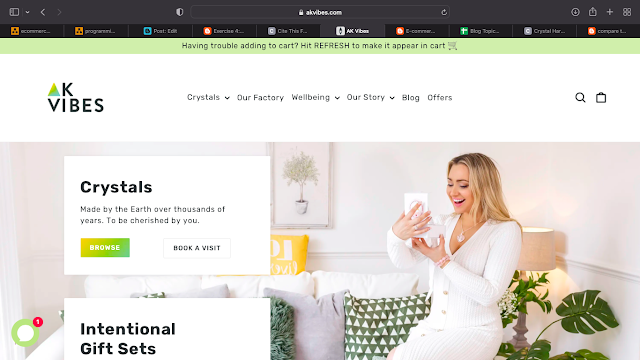
AK Vibes
AK Vibes header page is much clearer and well designed. Such as Crystal Harmony they included main hyperlinks to their page (Our Story, Offers) however instead and overwhelming the viewer with huge number of individual hyperlinks they categorise them into departments which are then rolling down with list of individual subpages.
The main disadvantages of AK Vibes is lack of option of creating profile. Is not only useful for consumer as all personal data is saved from previous purchase, but mainly is very beneficial for business (look Exercise 21-25)
However, the main body of Crystal Harmony page is chaotic and messy in comparison with AK Vibes. A huge amount of post with no order. CH do not have their company mission which is always a nice addition for main page.
Both pages included address to their studios - which are both available to shop in only by appointment. However to see an actual address to Crystal Harmony you need to follow link, when AK Vibes presents it clearly with addition of Google Maps link.
Leading to the end we focus on footers of both pages. Crystal Harmony included very easily spotted payment method which AK Vibes did not included in their footer. Crystal Harmony has link to their company story and contact details. AK Vibes has few general quick links and separate section for main menu links.
Both pages included newsletter and social media button.
To sum up both pages are visually pleasing for customer and easy to navigate – one more than the other but both are on easier side. However if Crystal Harmony would work on clarity of their page and AK Vibes would include few minor but game-changing features both pages would benefit massively.


Comments
Post a Comment